UP-NXT
Up-Nxt is a travel safety app for women, which helps female travelers get the safest destination information, danger detection, emergency help and other functions through multiple interactions between the phone and the watch.
-
10 Weeks
-
Vicky Song, Muskan Gupta, Sree Sevithaa
-
UX Design & UI Design
-
Problem Statement
Nowadays, many women want to explore the world on their own. However, according to Condor Women's Travel Statistics, 65% of female travelers stop traveling alone because of personal safety concerns. And there are no existing products to address this issue for them.
Opportunity Statement
How might we create a safe experience for solo female travelers so that they can enjoy their trips without worrying about their safety constantly?
Target User:
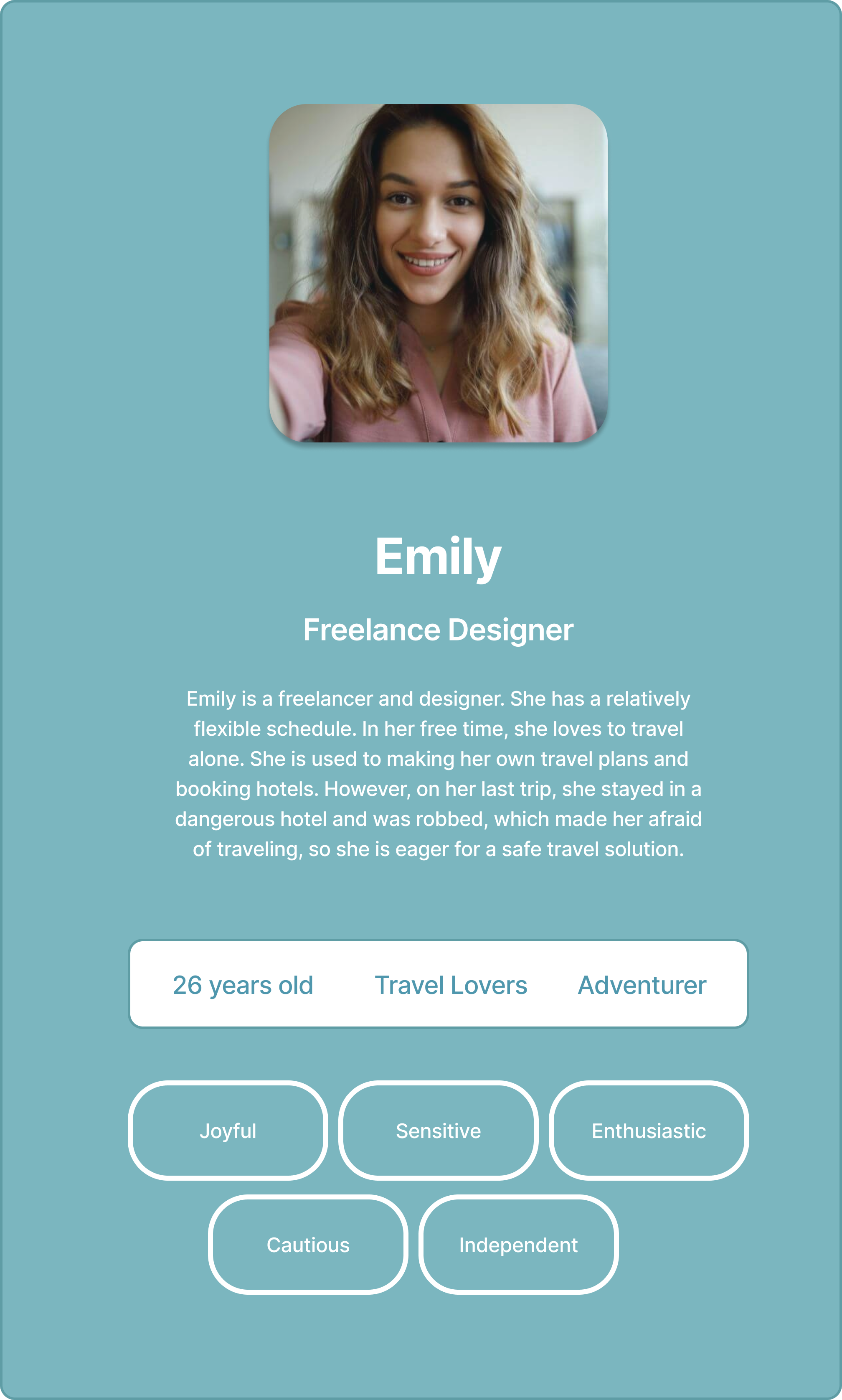
Female Traveller
Experience Overview
How did we get here?
Market Research
Travel companies dedicated to women-only customers have hugely increased by 230% in 2021
32 million single American women went traveling at least once over the past year.
The search volume for the term ‘female solo travel’ across all search engines has increased by 62% over the past three years.
65% of women in the US have vacationed without their partner.
What stops women traveling alone?
Many factors prevent women from traveling alone, but safety is undoubtedly the primary factor to consider
Affordability
Getting lost
Personal safety
UX Research
“"I enjoy traveling and exploring alone, but unpleasant experiences from my last trip make me anxious to travel.” — Chelsea
User Research & Interview
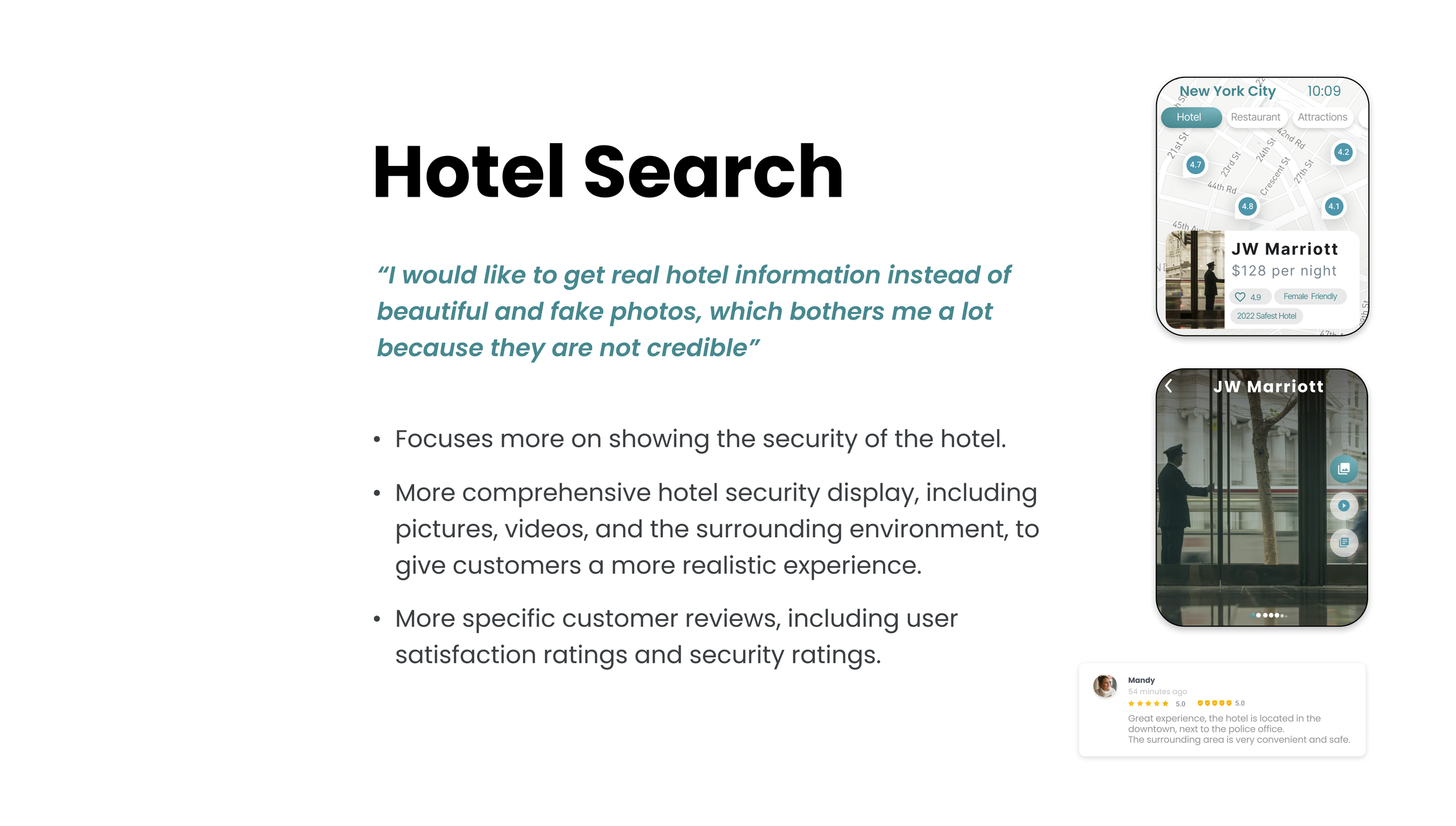
“The hotel I booked on my last trip was bad; It didn't look like it was shown on the website. Also, it was in a dangerous area, I didn’t feel safe. “ - Tina
“I learned on the news that there had been a shootout, and three people had died in the area I had visited an hour earlier. This made me feel scared because I had been shopping in the surrounding area and had no idea what was going on.” — Tanya
“I wish there was a dedicated safety app that would help me detect safe/dangerous areas during my trips and it would be great if I could get some local help during an emergency situation. “ — Liz
Key insight:
Female travelers comprise a large percentage of the overall travel market and are growing yearly.
Personal safety is the most significant factor stopping women from traveling, regardless of how experienced a solo traveler is.
Respondents specifically worry about the lack of credible sources of real safety data per destination and the travel industry’s marketing efforts to make a destination look safer than it actually is.
Ideation
Sketch rapid prototypes
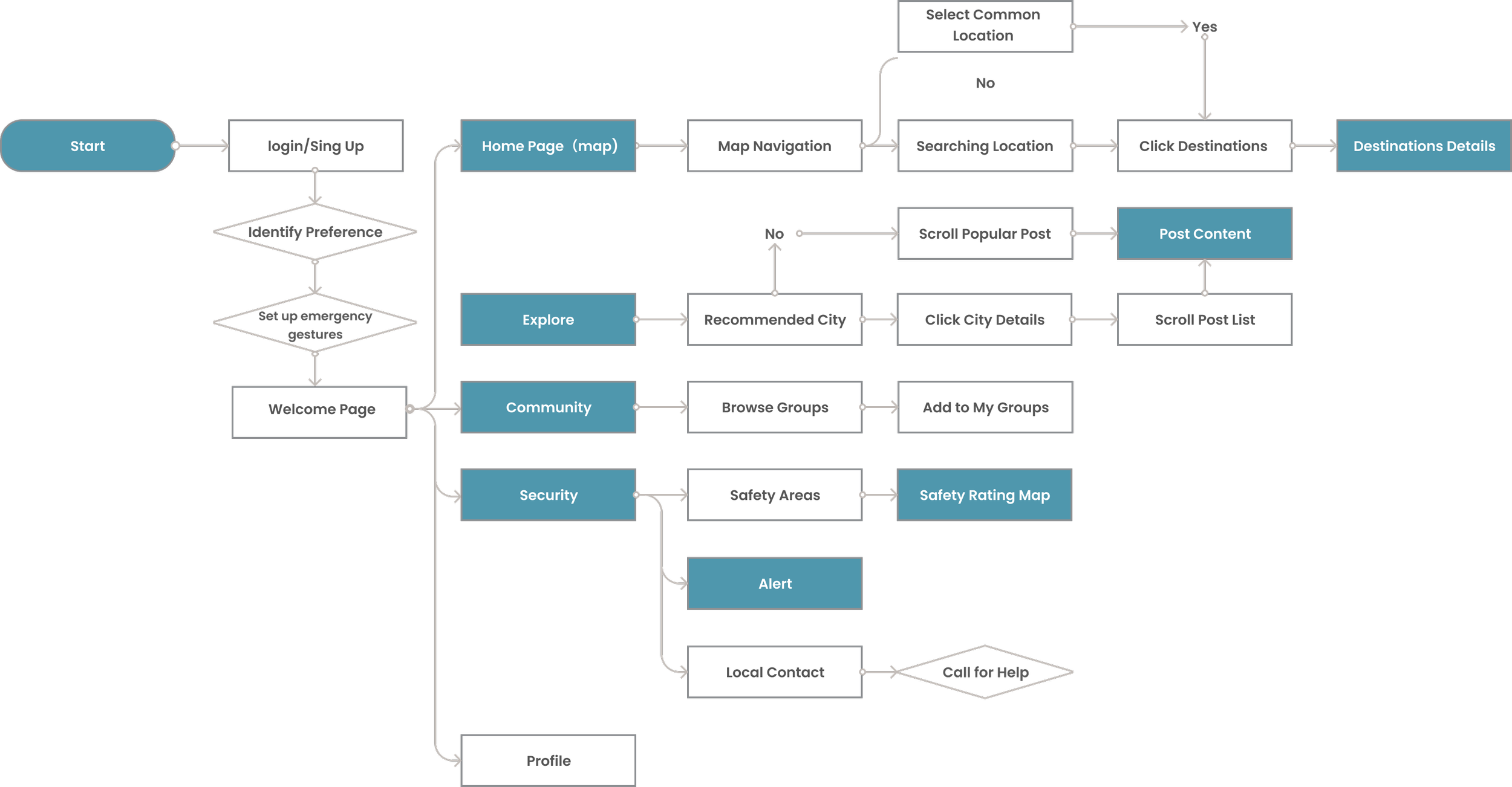
User Flow
Information Architecture
Low-fidelity prototype
Mid-fidelity prototype
Concept Testing
Key Insight:
Users are afraid to use community features because of the uncertainty
Most interviewees said they liked the concept of the emergency help feature, but how to make it more simple and quick needs further consideration
Interviewees asked once they get a live update about any danger of a fellow female traveler, what are they supposed to do? Should they inform someone? Or what is the next suggested step?
Users prefer the product to be used for all groups rather than serving only the female group.
Build trust between customers and the app in detail, such as by adding messages, slogans, and Icons.
Consider the diversity of users and build empathy.
Think about attracting customers to use the app often and leaving effective reviews.
Hi-fidelity prototype (Initial)
Usability Testing
Key Insight:
To evaluate this prototype, we conducted a task-based usability study with 6 participants This was followed by a qualitative survey that asked participants to describe their thought processes while performing the tasks. Here's a brief overview of the process:
Explain the concept behind the app to the users
Ask them to perform benchmark tasks one by one
Prompt for feedback after each task regarding what went well, and what did not
Analyze testing findings to find patterns within the data
Iterate designs based on new insights
Cons :(
Most of the users expressed concerns about emergency gestures, such as accuracy and complexity.
3 participants are confused about the personalization options when onboarding.
Copy such as safety kit, alerts, made a few of the participants feel confused.
4 participants indicated that the ALERT button should be accessible instead of just an alert
Some detailed text makes it difficult to read, such as the explore section
Pros :)
The majority of users gave positive feedback on the security zones, as well as emergency alerts.
Most users think the color and visual system of the app can give them a sense of security.
Participants were able to perform the tasks such as connecting local authorities, hotel searches, etc
.
Revise
Final Design
Design System
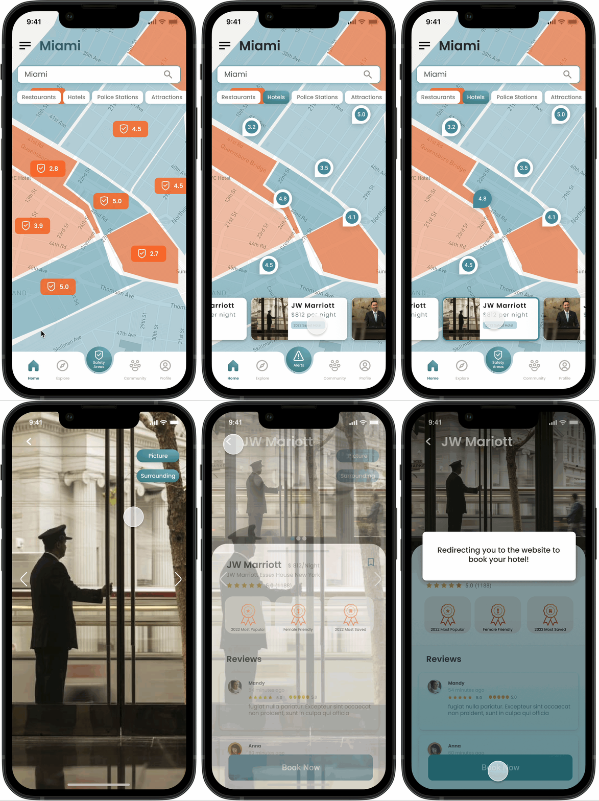
Through user research we found that visual, detailed messages can help female users feel safe. This is also the key to distinguish UpNXT from other travel apps in the market.
We realized that the emergency gesture feature might not be viable because of the accuracy to draw them on the screen, and to incorporate them through the phone systems. Users indicated that this feature was not effective in helping them in emergency situations, and we needed to find new design strategies.
How to effectively use the alarm function of IOS system may be the breakthrough of the product
Iteration is the key. We can continuously optimize the product's features and details through user research. A/B testing is necessary in the next step.


