
Ashford Tea
For this case study, we have been tasked with analyzing and improving the website navigation and information architecture for the Local business - "Ashford Tea Company”. Our goal is to create a seamless digital experience for their customers through a comprehensive website redesign and mobile optimization. We aim to help the Ashford Tea Company further establish and grow its business by streamlining the website and making it easier to use.
-
2023 Winter (10 weeks)
-
Vicky Song, Han Sun, Ting Lyu
-
Lead Designer
Wireframe, UI Design, Design System, User testing
-

Background
Ashford Tea Company, formerly known as Tea's Me Cafe Indy, is a premium tea store and distributor based in Savannah, Georgia. Their business includes a brick-and-mortar store that offers offline tea experiences and purchases and an e-commerce online sales channel that receives high praise from local customers.


Challenges & Goals
Business goals:
Engage Ashford C-users and strengthen Ashford’s identify.
Increase customer engagement, satisfaction, and conversion.
Increase user transaction rates.
Transformed the online service format to a more human-centered design, pursuing opportunities for small local businesses on a global scale.
Users goals:
Realize a convenient user experience of shopping, searching & buying in one.
Tasting and learning about the unique tea culture & enjoy tea.
Quickly learn about the offline activities of the store.
A clearer understanding of the brand services.
As e-commerce and user-centered design continue to expand, Ashford Tea wanted to provide a unified experience for their customers and a centralized design language for the brand. This resulted in more new user conversions and helped the company transform from a small, local business to a more international brand.
Key Selling Points
Our new visual system brings the aroma of tea to life. With high-quality images and color schemes, we evoke the rich aroma and flavor of premium teas. With every click, you'll feel like you're stepping into a tea garden.

We've crafted a more user-friendly experience by paying close attention to the details. From small product category logos to tasting notes, our site is designed to help customers find the right tea products and enjoy them to the fullest.
Experience our immersive scenario-based shopping and find your perfect tea. Our products are showcased in actual scenes, making it easy and fun to explore and purchase. Simple interactions bring the experience to life, making shopping more youthful and engaging.


Aroma-Infused Visuals
User-Friendly Details
Scenario-Based Shopping


How Did We get there?
UX Research
Market Research
Before the whole project started, we first did market research. The purpose was to understand the basic background of the entire U.S. tea market by observing and predicting new or existing trend changes.
The purpose of market research includes the following questions
What is the size of the U.S. tea market, in terms of revenue, sales volume, and growth rate?
Who are the target users of tea products in the U.S. market?
How do people currently purchase tea in the U.S.? Are there any pain points or opportunities for improvement?
What are the key drivers and barriers to tea consumption in the U.S., and how do they differ by consumer segment?
How do consumers discover and purchase tea products in the U.S., and what factors influence their decision-making process?
What is the competitive landscape for tea products in the U.S. market? Who are the major players and what are their unique selling points?
What are some emerging trends or innovations in the U.S. tea market? How are consumers responding to them?
Key Insights

Takeaway
To further understand the brand, we went to the ground to observe and interview the owners and customers of Ashford Tea, In the process, we did find out more problems and potential design opportunities
Problem Statement:
The U.S. tea market has growth potential, but there is a lack of well-known tea brands comparable to Starbucks. This poses a challenge for local tea shops seeking to expand nationally and requires the development of a distinctive brand identity and user experience, both online and offline. However, many local tea shops currently have websites and mobile apps that fail to communicate their brand and provide a seamless user experience effectively. This presents an additional obstacle for tea shops looking to expand their reach and engage customers through digital touchpoints.
Opportunity Statement:
Local tea shops can establish a national presence and capture a significant share of the growing U.S. tea market by creating a distinctive brand identity and seamless user experience across digital products such as a website, mobile app, or online store. By leveraging targeted UX design and marketing strategies, tea shops can build a loyal customer base and achieve sustainable growth. Through a focus on digital touchpoints, tea shops can differentiate themselves and establish a competitive edge in a crowded market, positioning themselves as leaders in the industry.

Examine Current Website
While websites and mobile apps play an important role in establishing a unique brand identity and seamless user experience for brands, Ashford Tea Company's existing website seems unable to do it.

Header
1. Complicated Visual Structure
A four-line horizontal structure in the navigation bar area results in unclear function navigation.
2. Misleading Navigation Bar
Ambiguous categorization and repeated labels can lead users to pages they are not expecting.

Hero Page
1. Redundant Information
Excessively redundant information prevents critical information from being captured by users, reducing brand exposure.
Blurred information architecture, unable to distinguish primary and secondary information.
2. Unreasonable function settings
The consultation function does not need to appear on the homepage, visually reducing the importance of the purchase button.
Duplication of information with the pop-up consultation box in the lower right corner

Service Section
1. Features not highlighted
Online Shopping
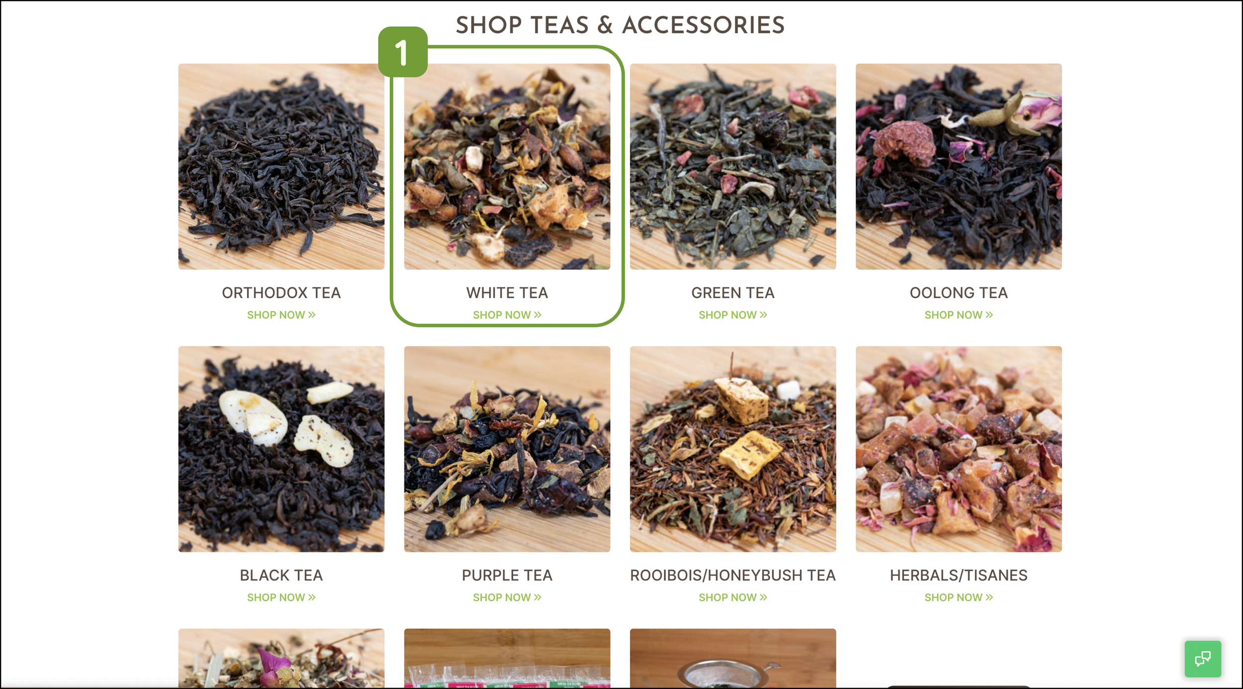
1. Lack of Products Category
The uncategorized product display is not suitable for new consumers who lack professional knowledge about tea, it will make the products very confusing for them

Event & Blog
1. Improper Priority
The jump button to the purchase page should be merged with the product purchase page above and given the highest priority instead of requiring several scrolls to reach.
2. Unreasonably Classified Layout
News about tea and the resource database should not be set in the same section. And many times, people buy tea because they are attracted to a cultural life represented by tea, and tea culture or tea news should be given higher priority.


Footer
1. Highlight the Address
As the information to lead customers to the physical store, the store address should be placed in a more prominent or accessible position.
2. Duplicate Information
A lot of information repeated with the previous section reduces the possibility of other important information being perceived by users.
Identify Users
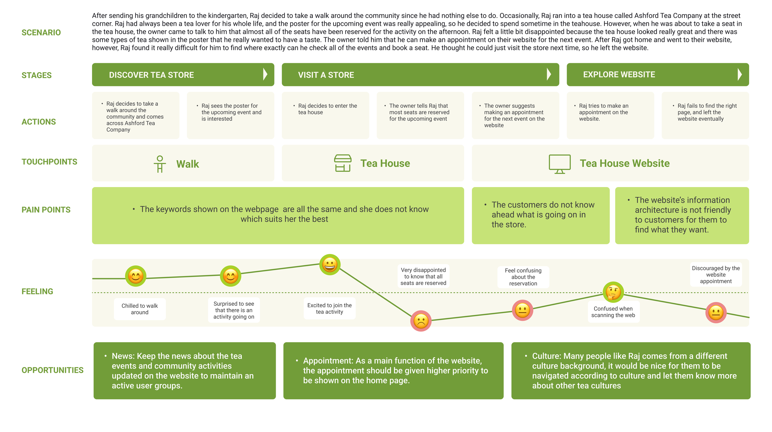
In order to validate the problems we posed with the existing website, we conducted a first round of user testing and interviews. Based on the insights from the interviews we further analyzed the main user psersonas and user journeys.
We divided the target users into three main categories according to Segmentation Research
Age group 16-25: This group consists of younger individuals who have been introduced to tea beverages, such as bubble tea and iced tea. They enjoy the social atmosphere and pleasure that tea brings and may be interested in trying new and unique tea blends.
Age group 25-40: This group includes middle-aged individuals who may not have an in-depth understanding of tea, but are interested in incorporating it into their lifestyle as a healthy and decaffeinated alternative to coffee.
Age group 50 and above: This group includes older individuals who already enjoy tea and may have a deeper appreciation for its history and cultural significance. They may be interested in learning more about the different tea cultures and trying high-quality and traditional tea blends.


Key Insight:

UX Design
After thoroughly learning about Ashford Tea Company and their customers & market position. We set out to improve their overall e-user experience.
The Process Included the Following:
Review of how the consumer navigated the site, and got to the needed information.
Redesign the original site map, including the website header and footer.
Add new panels and information based on user research.
Redesign: home page, product page, product detail page
Adding new ways of interaction and introducing the possibility of scenario-based marketing
Redesigned Ashford mobile app to increase user accessibility to the brand
Current Site Map:


Revised Site Map


Mobile Design
Mobile web design is essential for a user-focused company. I scaled down my original designs to be aesthetically appealing, user-friendly, and easily accessed from anywhere.
Below are some of the final homepage designs for the mobile site.

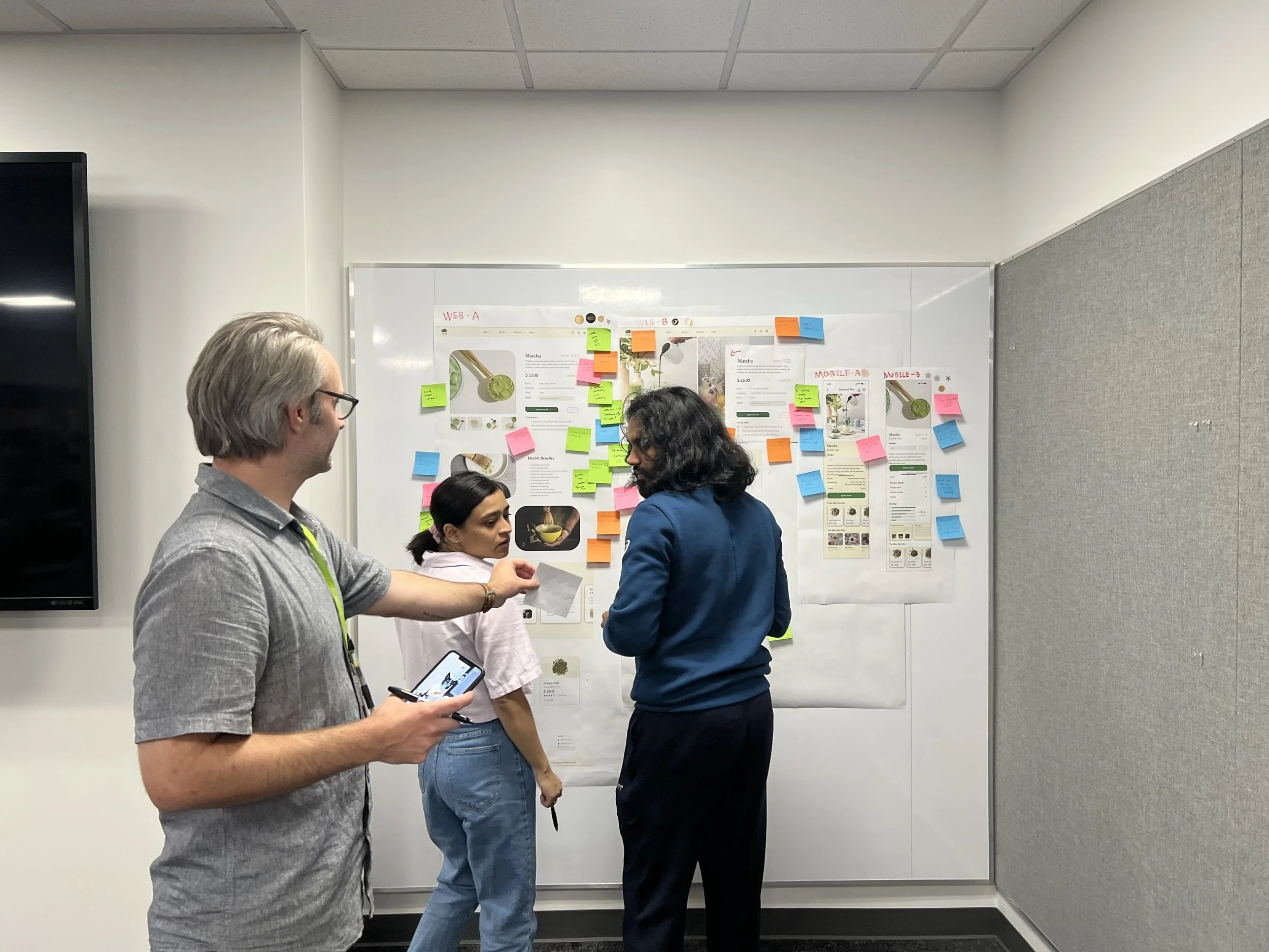
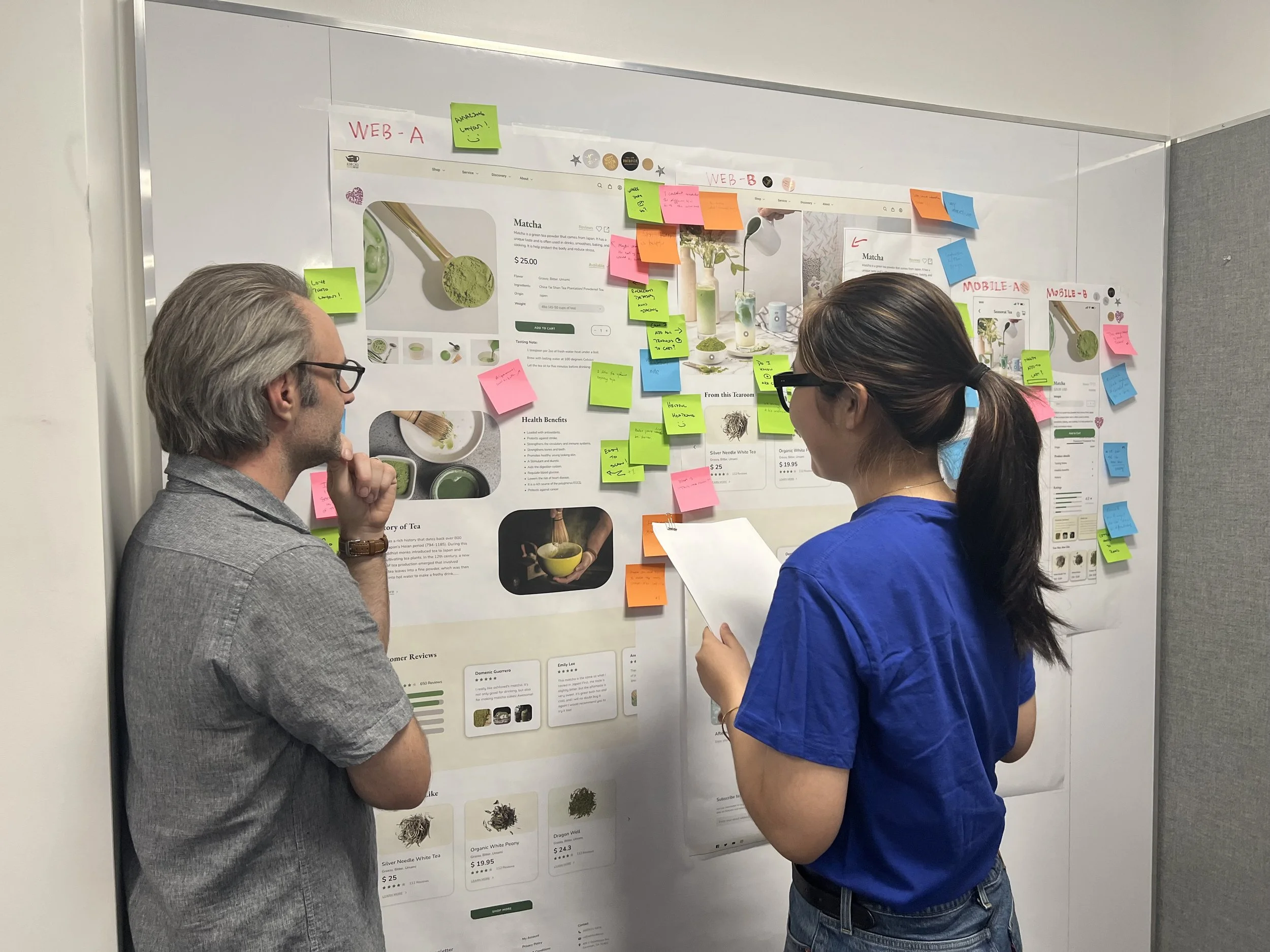
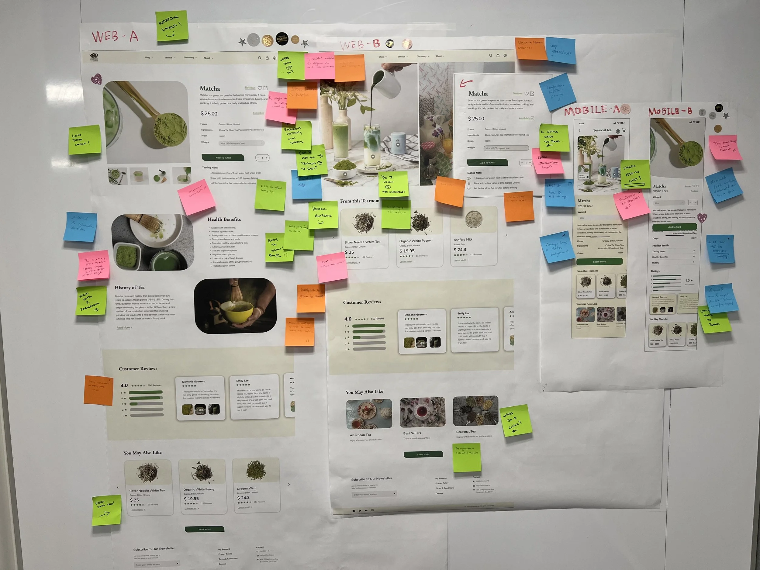
User Testing
For the product details page, we created two versions with distinct styles and conducted an A/B test with users to determine which version was more visually appealing and easy to understand.
See below for images of user testing.
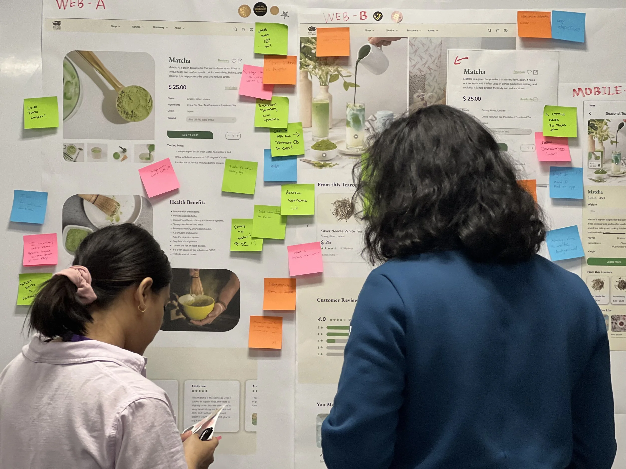
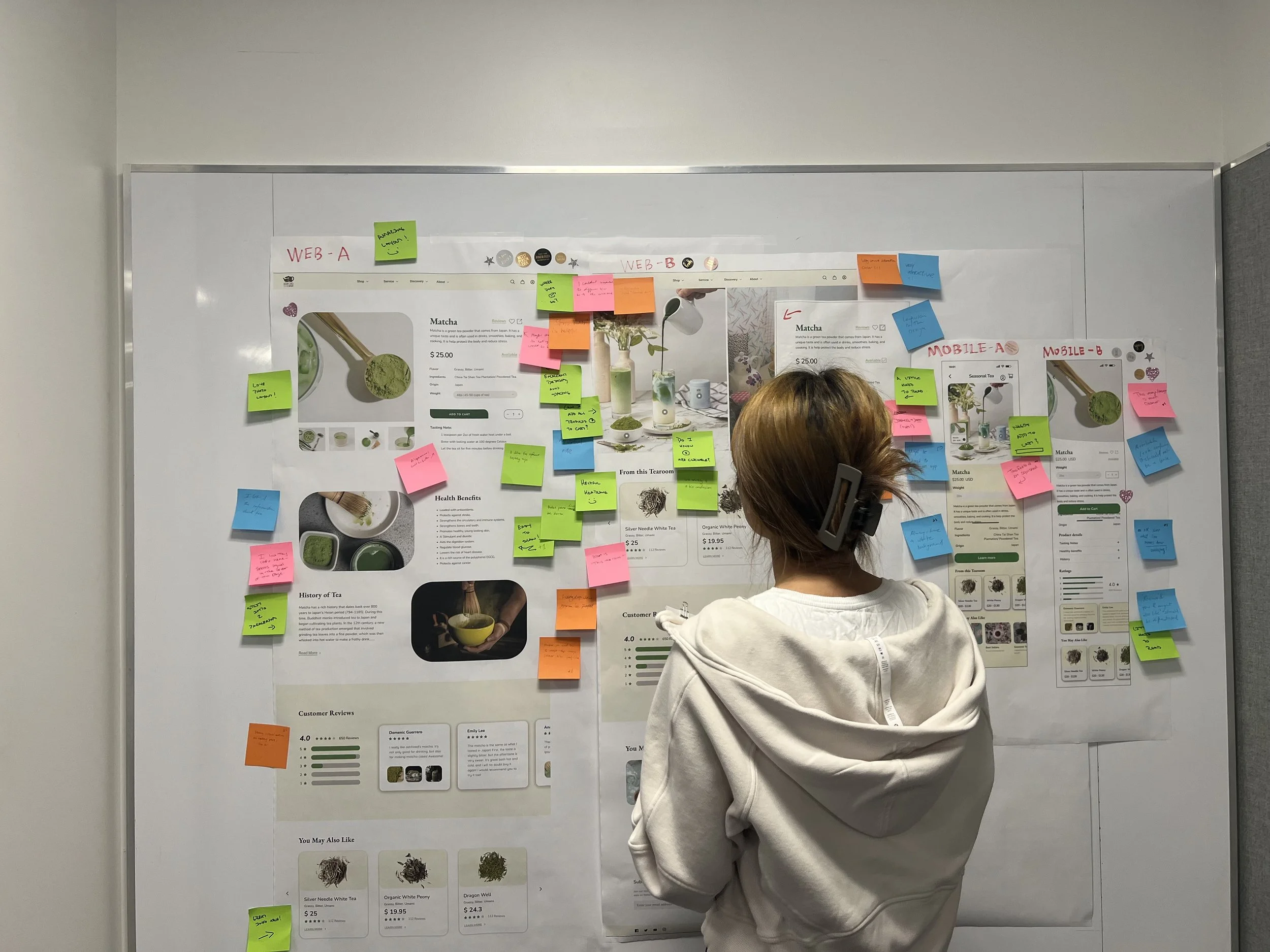


Takeaway from A/B testing
Breaking the mold & innovation
In our A/B testing, we experimented with presenting one version of our product in a scenario-based manner. While this idea was well-received by young users, we also encountered some issues, such as users feeling that the product information page needed to be more visual.
After thorough research and discussion, we decided to combine the best of both worlds. We kept the basic product listing structure, but also introduced a new immersive shopping experience that showcases our products in real-life scenarios. This approach makes exploring and purchasing our products more enjoyable and engaging, with simple interactions bringing the experience to life. Additionally, we retained a straightforward presentation of our products to meet the needs of all users."

Before & After Design
Check out our work visually by comparing the same section before and after


Before - Navigation (Header)
After - Navigation (Header)

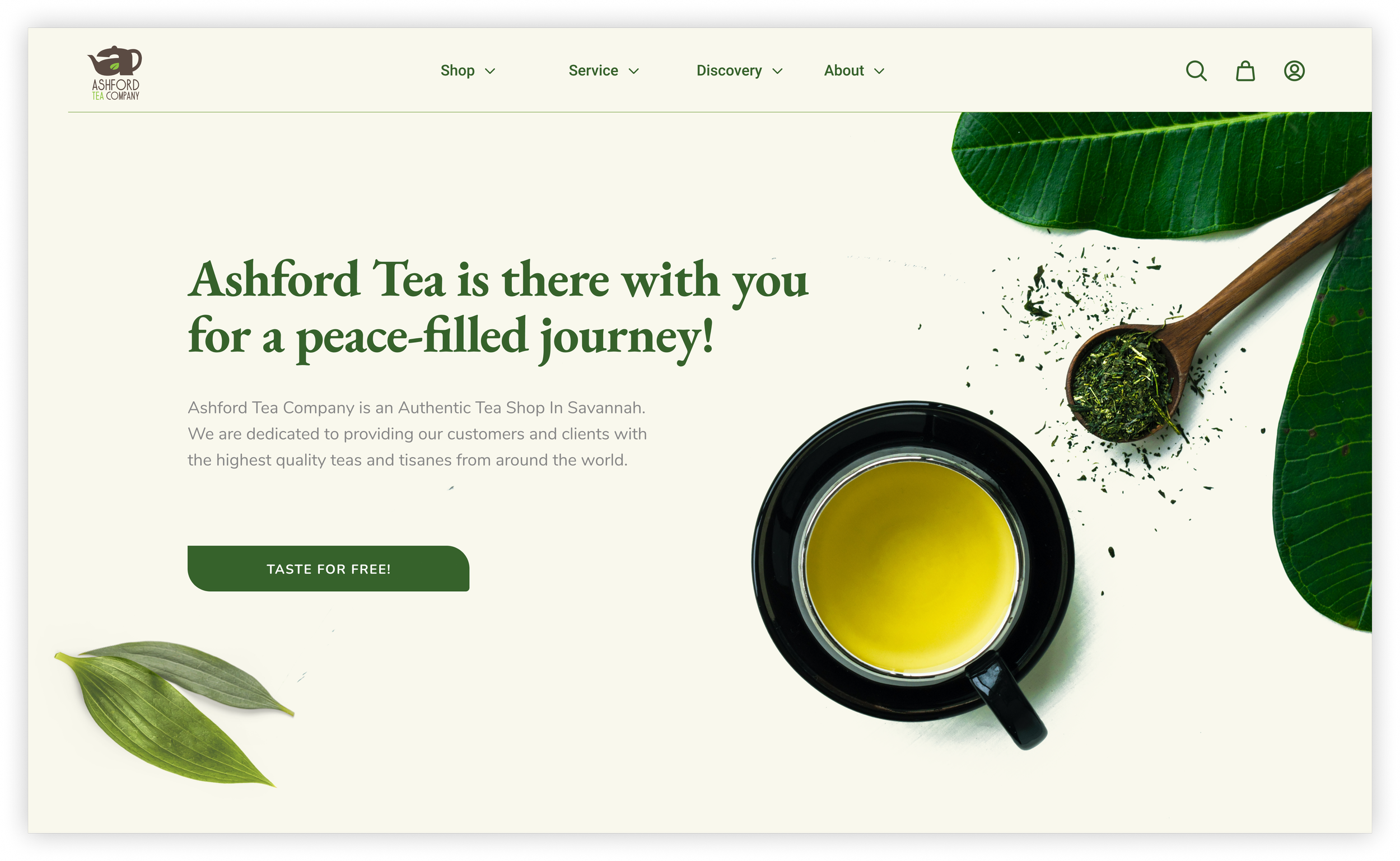
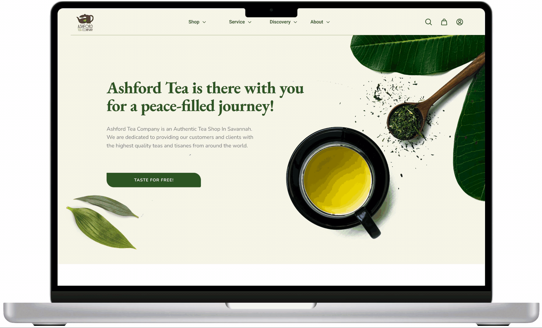
Before - Hero Page
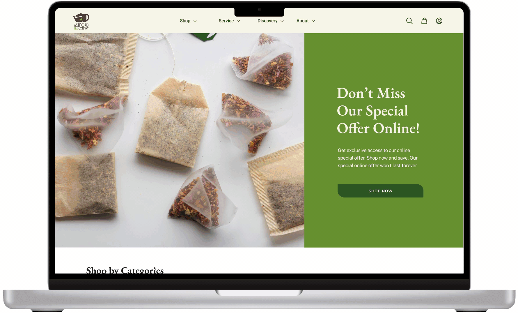
After - Hero Page


Before - Services Section
After - Service Section


Before - Online Shopping
After - Online Shopping


Before - Product Detail Page
After - Product Detail Page


Before - Footer
After - Footer


Before - Event & Discovery
After - Event & Discovery

Takeaway
Effective Website Navigation and Information Architecture Are Critical for a Positive User Experience
The Ashford Tea project taught us that effective website navigation and information architecture are critical for creating a positive user experience. By understanding the needs and preferences of the target audience and implementing user-centered design, we were able to streamline the website and make it easier for users to find what they need. Ongoing testing and iterative design are crucial for continuously improving the website's functionality and usability. By implementing these best practices, businesses can enhance their online presence and drive growth.
Next Step
Conduct More User Testing to Improve Scenario-Based Shopping
We found that users were confused about the source of the scenarios in the scenario-based shopping feature on the Ashford Tea website. To address this issue, we recommend conducting more user testing and incorporating feedback into the iterative design process. By observing user behavior and refining the feature based on their feedback, we can ensure that it is clear and easy to use. This will ultimately improve the overall user experience on the website.